PLONK
A No-Code WebAR CMS
Launch Augmented Reality campaigns fast, easy, no fuss.
Role
UX/UI Designer
Agency/ Client
Rev Illimité (f.k.a REVEZ Motion)
Project Type
Product Design
The Challenge
Adapting Public Experiences in a Post-COVID World
COVID-19 made traditional public interactives unsafe.
The core challenge
How might we leverage WebAR to transform traditional public interactives into accessible, low-contact, and highly engaging experiences for everyone?
The Solution
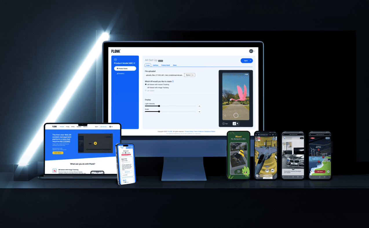
Introducing PLONK A No-Code Web Augmented Reality CMS
PLONK is a no-code, SaaS WebAR CMS. It enables marketers to create browser-based AR campaigns, transforming public interactive activations for safety and engagement.
My Role
Leading Service and Cross-Platform UX Design
As Lead UX Designer (team of 3), reporting to the Chief Creative Technology Officer. I led design across PLONK's Product Microsite, CMS Platform, and AR Application Web App. My focus was on intuitive UX, responsive design, and progressive development to deliver a powerful, adaptable tool.
Contributions
Research
Stakeholder Management
Information Architecture
User Flow Design
Design System
UX and UI Design
Prototyping
Exploratory Testing
User Testing
Design Audit & QC
Agile Workflow and Design Coordination
Design System Management & Implementation
Design Question
How might we simplify WebAR content creation for marketers, enabling effortless, low-contact public experiences?
Design Approach
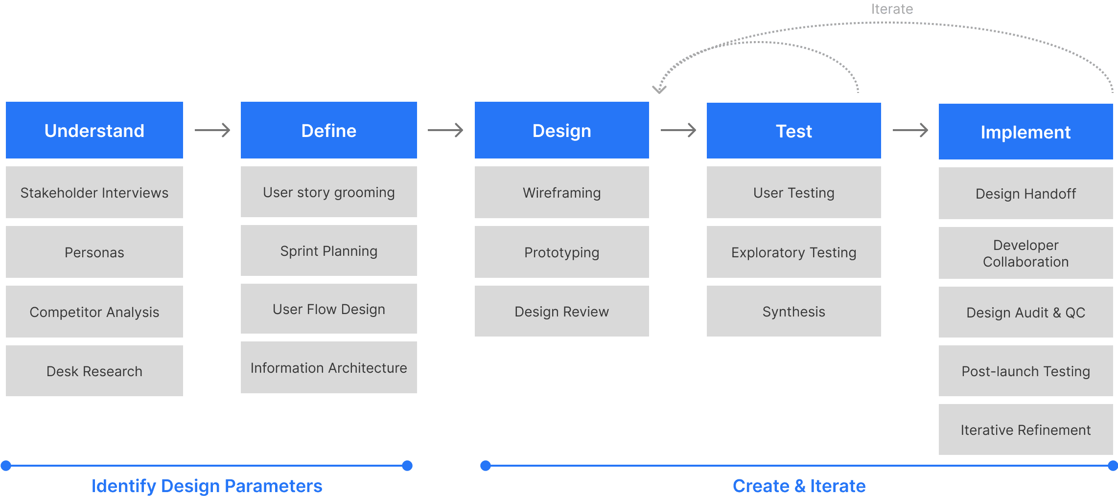
Discovery & Research
Things that Matters
We kicked things off by chatting with both our internal teams and potential users to grasp their needs and goals. At the same time, we scoped out the market to see what was already out there, helping us pinpoint key gaps. This research led to 5 critical findings that shaped our solution.
Different Users, Different Needs
Users vary widely in tech skills and motivations.
The platform will serve different users (creators and consumers) with tailored experiences.
Clarity Builds Trust
If users feel confused or unsure, they drop off. Redemption and onboarding must be crystal clear and reassuring.
Track Value, Scale Smart
The business relies on proving ROI, managing subscriptions, and supporting creators with scalable tools and insights.
Make Building & Handover Easy
Campaign creators need better tools for collaboration, reuse, and sharing with stakeholders across teams.
People Want to Share & Come Back
Users enjoy personalising and sharing content; they will return if the experience is fun, rewarding, and simple.

Design & Iterate
Designing the Touchpoints
Our research quickly showed we weren't just designing for one user, but three distinct groups, each with unique needs across our three touchpoints.
The challenge was to design a unified system that made sense for all, without overcomplicating it for any single group. These insights guided our content and feature development for each touchpoint.
01.
Product Microsite
User
The Buyer
Goal
See Value Fast
Features/ Content:

02.
Web AR CMS
User
The Creator
Goal
Build, Manage, Launch campaign easily
Features/ Content:
03.
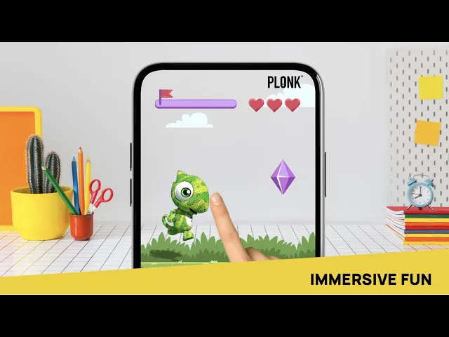
Web AR, Mobile Web App
User
The End User
Goal
Experience Magic, Share Easily
Features/ Content:
04.
Visual Design & System
Three design tracks ran almost parallel.
The Product Microsite set the aesthetic direction, while the other platforms prioritised functionality with a focus on simple key colours.
Eventually, we developed a comprehensive design library to govern all three touchpoints.
Tackling Key User Experiences
PRICING PAGE
Problem: Our long pricing page is unreadable for busy, on-the-go mobile users.
Opportunity: Optimise the mobile pricing page to boost user comprehension and engagement.
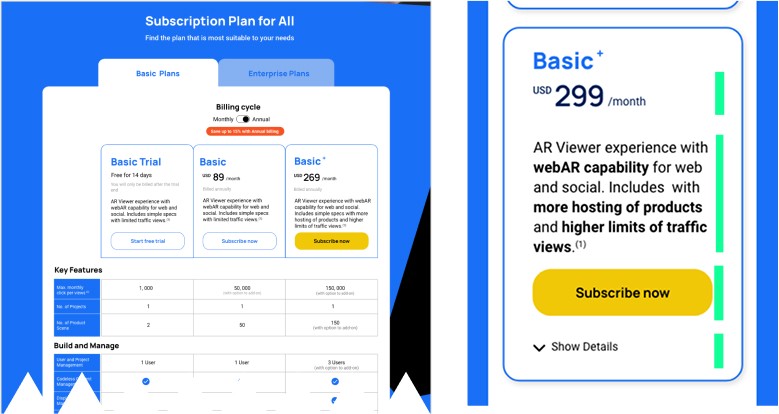
Pricing & Value First
Users' immediate priorities are "How much?" and quick access to key benefits.
Device-Specific Behaviours
Mobile: Users scan for bolded highlights for quick mental comparisons.
Desktop: Detailed, executive-level comparisons and research are conducted, leveraging our comprehensive table.
Design Strategy
Show critical upfront details and key highlights for mobile-first scanning, while collapsing extensive information for deeper exploration on desktop.
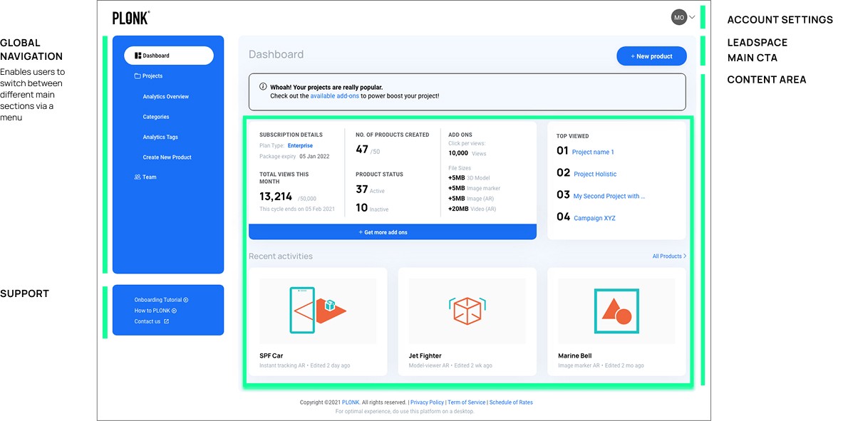
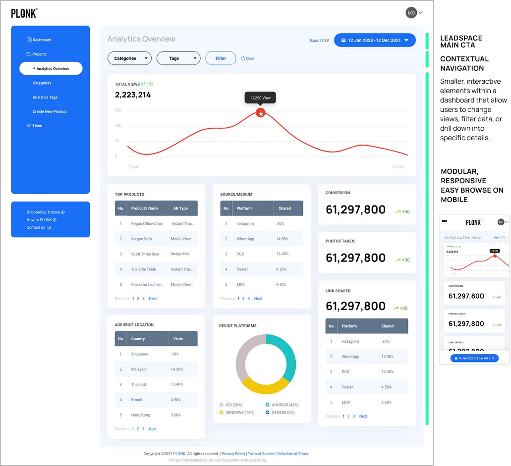
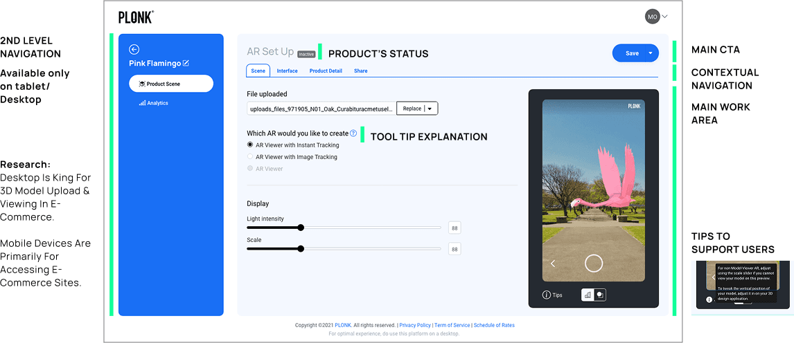
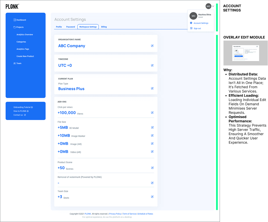
CMS - Navigation
The CMS presented a multi-layered navigation challenge, as different users needed access to various elements like settings and campaign creation (a primary action). To address this, we studied effective dashboard designs and competitor approaches, developing a robust navigation framework:
Impact
Reflection
Leading PLONK under tight timelines sharpened my ability to prioritise effectively and align stakeholders with diverse needs. I embraced adaptability, stepping beyond my core expertise to support technical teams and ensure smooth progress despite ambiguity. Though the project pivoted due to legacy technology challenges, the experience deepened my skills in managing complex digital initiatives and reinforced my confidence to lead with both strategic vision and pragmatic execution.